Get in the picture – using infographics to share and promote research
Infographics are visual representations of information, data or knowledge which are used to present complex information in an appealing way and are a great way to summarise content and highlight key findings/items of interest.
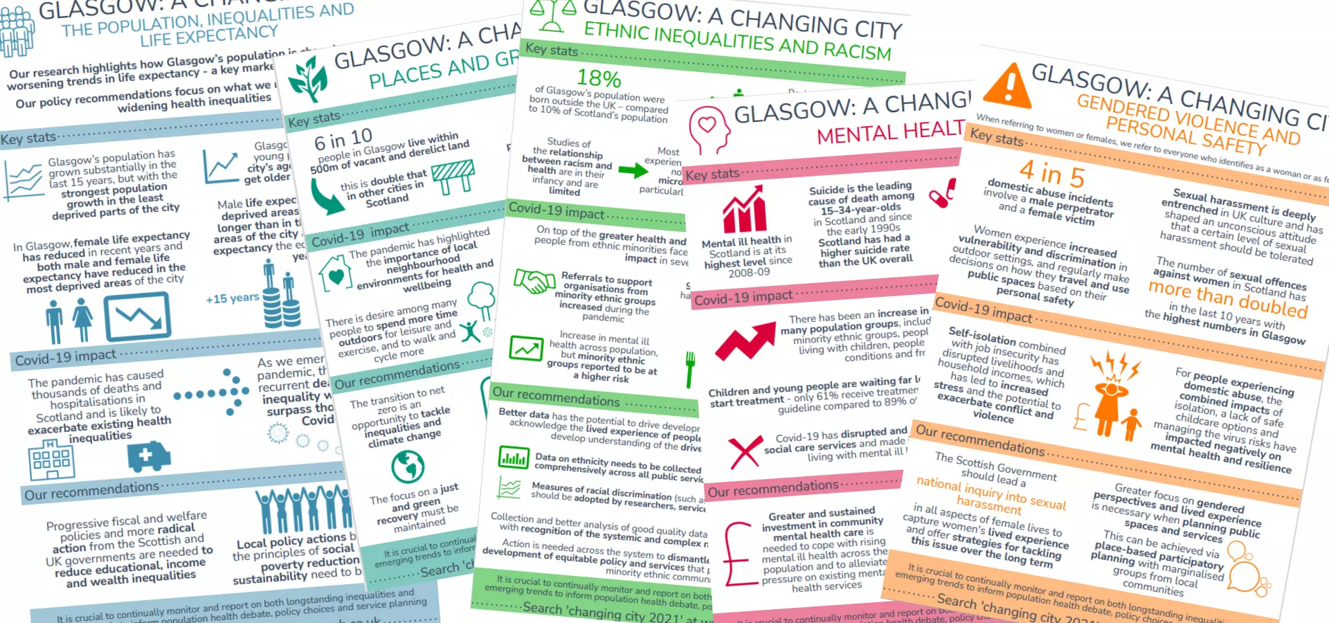
Infographics make research findings and data more accessible to users who may otherwise be put off by stat-heavy content. As an example, we use infographics on the Understanding Glasgow web resource to help summarise and highlight key data from our sets of health and wellbeing indicators.
 In this infographic, I highlight the increase in Glasgow’s population, the population’s relative diversity, how the population is ageing and the changing nature of households in the city.
Using infographics and social media as 'hooks'
When promoting data and complex research it can be helpful to think in terms of a spectrum; items such as infographics and social media posts as a ‘hook’ to draw people in to the more detailed resources such as full reports and data.
Combining the two, i.e. posting your infographic in a tweet or on Facebook, can be an effective communication method as images in a social media post are more eye-catching than simply using a website link.
In fact, Twitter users are more likely to retweet an image than a tweet with a link so it’s worth taking the time to incorporate relevant infographics into your social media and online communications strategy.
Collaborating and ensuring accuracy
The best way to make a good infographic is to approach the process in a collaborative way. When I’m creating an infographic, I liaise closely with my researcher colleagues to discuss the findings and data, work out what the ‘story’ of the graphic will be and ensure that the key details to highlight are included – this is an informal and very valuable process.
It can be easy to get carried away with the design of the infographic but it is important to ensure that the accuracy of the information is not compromised by the data visualisation process. Involving relevant colleagues and making time for ‘sense-checking’ is a good way to make sure the finished infographic is accurate, as well as attractive.
Creating an infographic…
Infographics are fairly easy to create – I use an online application called Piktochart to create our infographics as I like the user interface and the functionality. There are many free online tools available so it’s worth spending some time finding out which one you prefer to use.
 There are different ways to approach making an infographic and a lot depends on the type of information and/or data you are trying to include. However, I have some key design tips which are useful to consider and what better way to illustrate how to make an infographic than by using an infographic!
…and getting the most out of it
When you’re making infographics to help promote your organisation’s research, have a think about potential uses, beyond simply sharing on social media. There are varied uses:
- Present headline data and key information in a one-page graphic
- Make a bulleted list more visually engaging
- Smaller graphics can break up text in a longer report or on a web page
- Highlight key figures in a conference poster using an eye-catching graphic
- Make your presentation slides more visually appealing
- Printed versions make great handouts and can help facilitate discussion – people can use them for referencing key facts and numbers as they talk. We use the infographics on Understanding Glasgow as part of the Glasgow Game to help people use data to explore different topics.
A thousand words
So, to wrap up, the next time you’re planning to promote a piece of research or want to highlight key data, consider saving yourself a thousand words and making an infographic to put people in the picture.
In my next blog I’ll be looking at tips for sharing research findings using blogging.