The anatomy of a GCPH infographic
Infographics are a key part of the Centre’s communications and are used to support the promotion of our research, alongside outputs such as media releases, blogs, website news articles and social media promotion.
I often receive requests from colleagues and partners for support in how to develop an infographic for the first time or for a particular piece of work, to aid the communication of their key messages and findings.
The information spectrum
I like to think of research communications as spanning an information spectrum. The diagram below shows the idea of a scale of detail, enabling different audience communication needs to be met through different research and communications outputs.
As you can see, infographics are a way to hook people in and pique their interest in the more complex items on the information spectrum, as well as a handy way to highlight key points, giving the audience a top-level take-home message. They can also provide a visual output to go along with text-heavy research papers and briefings.

Our infographics cover a very wide range of topics and types of research, but they all share a similar ‘anatomy’, which is a good way of providing consistency in terms of design and look. The four infographics described below give examples of how very different types of data and information can be organised visually in similar ways.
The skeleton of any infographic is the basic narrative and main ‘takeaway’ point for the audience. So essentially, what story are you telling people in the infographic and what do you want them to do once they have looked at it? The anatomy of the graphic is then fleshed out by visualising the data and information in a way best suited to the skeleton.
GCPH infographics tend to have a big clear title, a small amount of context-setting text, the main data/information content and any call to action or recommendations, finishing with a simple way for the reader to access further information on the topic.

Example 1
In this child poverty infographic we have a big, clear title, context setting sentences explaining why child poverty is relevant to health and wellbeing, a big point of data showing the severity of the issue, solutions for the problem, and where to get more information.
Example 2
This infographic showing the demographic characteristics of Glasgow if it was a village of 100 people is a more data-driven example than the child poverty one but you can still see the same overall facets in terms of title, context setting, main data content and where to get more information.

Example 3
There is no numerical data at all in this next example of a graphic factsheet outlining the links between climate change and public health. After the big title and context-setting sentences, the concept is explained in a set of simple explanatory points, leading the reader through the issue down to the bottom where they can then access further information.

Example 4
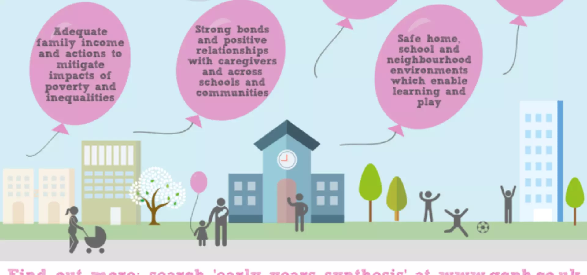
This last example started life as a simple bulleted list of recommendations from our early years synthesis report but turned into something really eye-catching (and a bit fun – I love the balloons!). But even in this very visual design, again there is a clear title which poses a context-setting question, the key narrative or recommendations in each balloon and information on how to find out more at the bottom of the graphic.
We have produced nearly 70 full page infographics so far, as well as various smaller graphics that we use on social media and in reports and presentations.
Let us know what you think!
We work to make our research accessible and interesting and infographics are a key part of this. We’d love to hear any feedback you have on whether or not you find the GCPH infographics useful, if you use them in your work, as well as any suggestions for future infographics or other ways to make our research more accessible.